bientôt jeu video interface design
How video game UX can bridge the gap between players and the game
User Interfaces exist as a layer between the player and the game. As a UX/UI designer, the goal is to build a bridge that the player can cross. One which links the real world — a controller, a mouse, a touch screen — to the abstract and complex mechanics of a game.
![]()
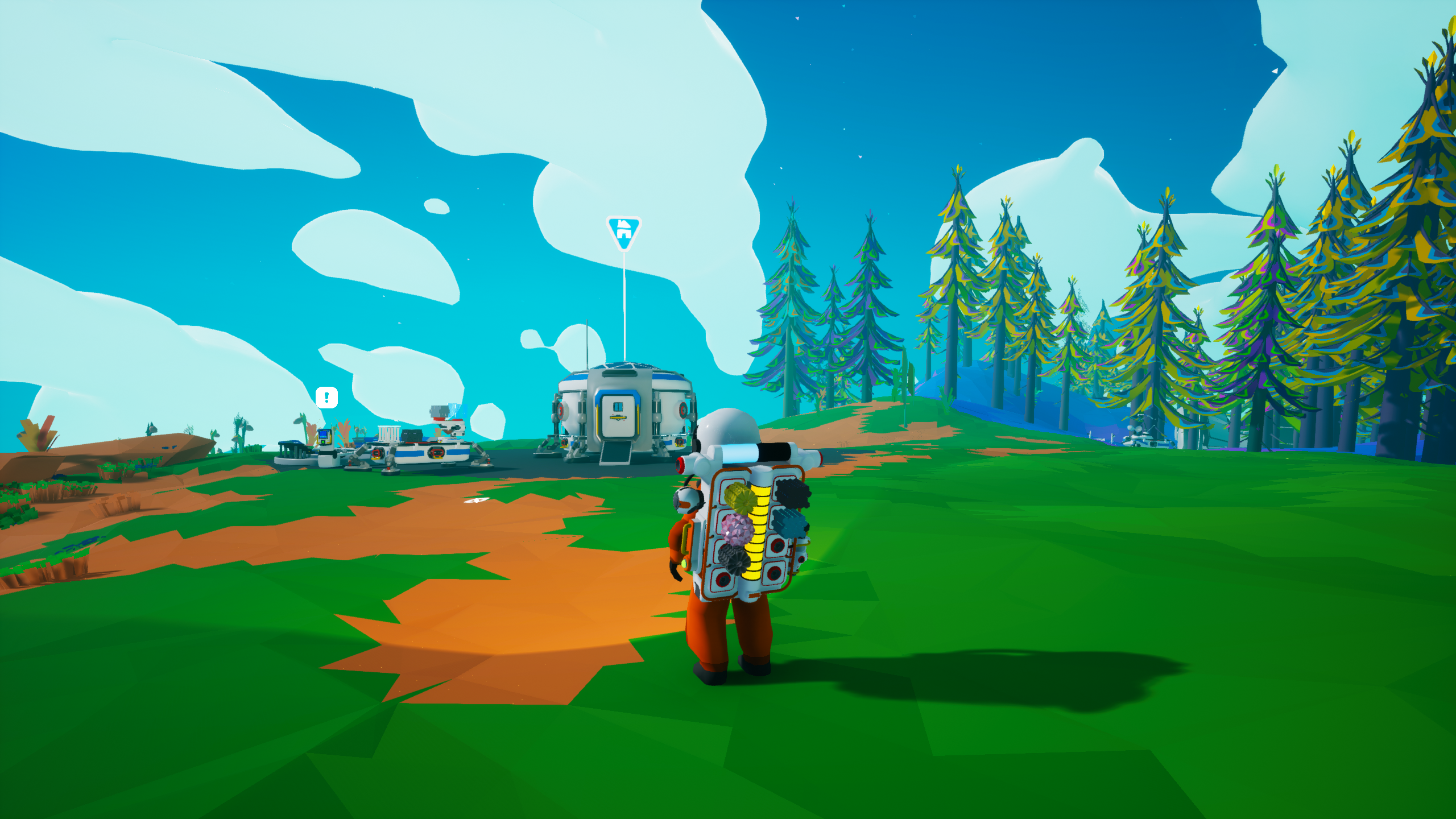
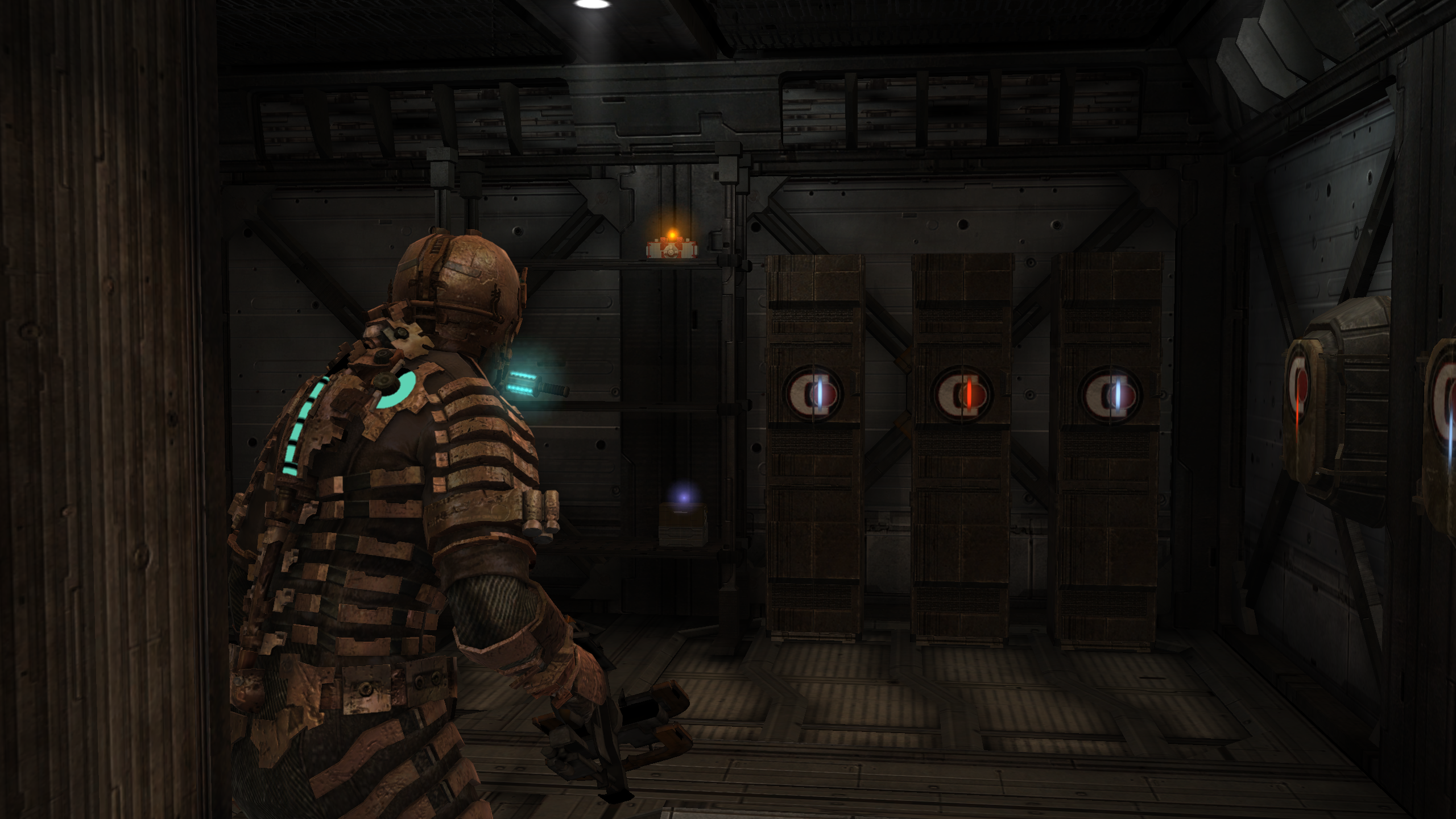
Occasionally the interface layer is finely interwoven, almost indistinguishable.
More often, it's disconnected; just a layer of buttons and information sitting above everything else.
Neither is inherently wrong, but the overall experience of the game can be directly influenced by the decision.
By exploring where different games and their mechanics fall on this spectrum of "interwoven" and "disconnected", we can analyse the effect that UI decisions have and apply this to our own process as designers.
Throughout this article, I will highlight the impact these design choices have on a game by citing examples and analysing why they work — or don't work — so effectively, demonstrating the importance of balance and consideration.
Example 01: Astroneer
The simple joy of picking stuff up and putting it down again
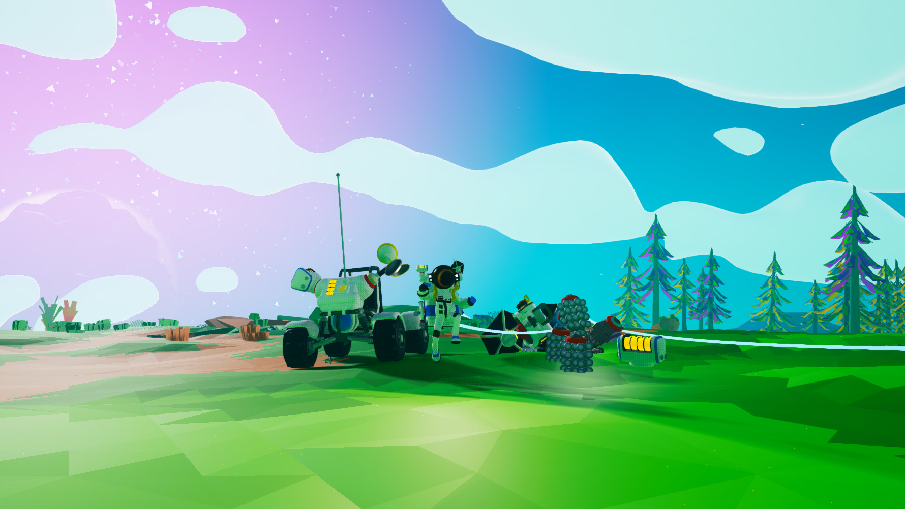
Astroneer is a charming and colourful indie game about exploration, survival and crafting. By traversing alien planets and gathering resources, the player can build bases and progressively research more advanced technology.
It's also a great example of how the UI of simple, well-established conventions can be handled in a fresh and ingenious way — without sacrificing the familiarity of those mechanics.
The Backpack
When it comes to video games, it doesn't get much more familiar than the humble Inventory. As with other games, in Astroneer the items you gather and lug with you on your adventure are stored in a backpack (at least, until you can offload them into larger containers later).
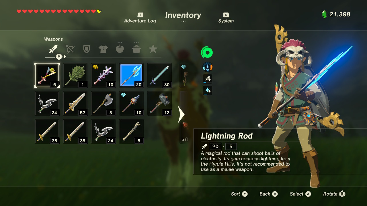
Backpacks are a common device, although their depiction varies. Sometimes invisible and bottomless, the existence of the backpack may just be loosely implied. Think along the lines of Zelda: Breath of the Wild.
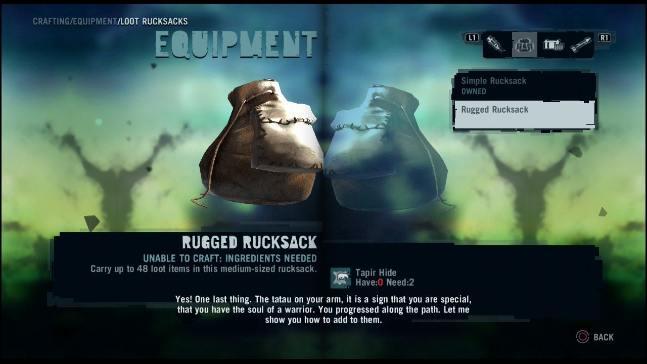
Other times it's more realistic and displayed in the UI — potentially treated as an item itself that can be swapped or upgraded to increase carry capacity, as shown with Far Cry 3, above.
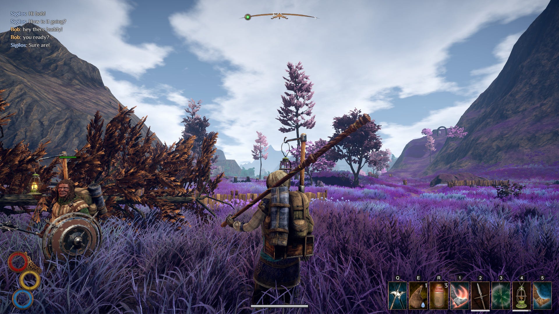
Outward takes this to another level. Not only are different backpacks shown accurately on the player's model, they also influence combat and movement as well as carry capacity. Your inventory is tightly interwoven with the game universe.
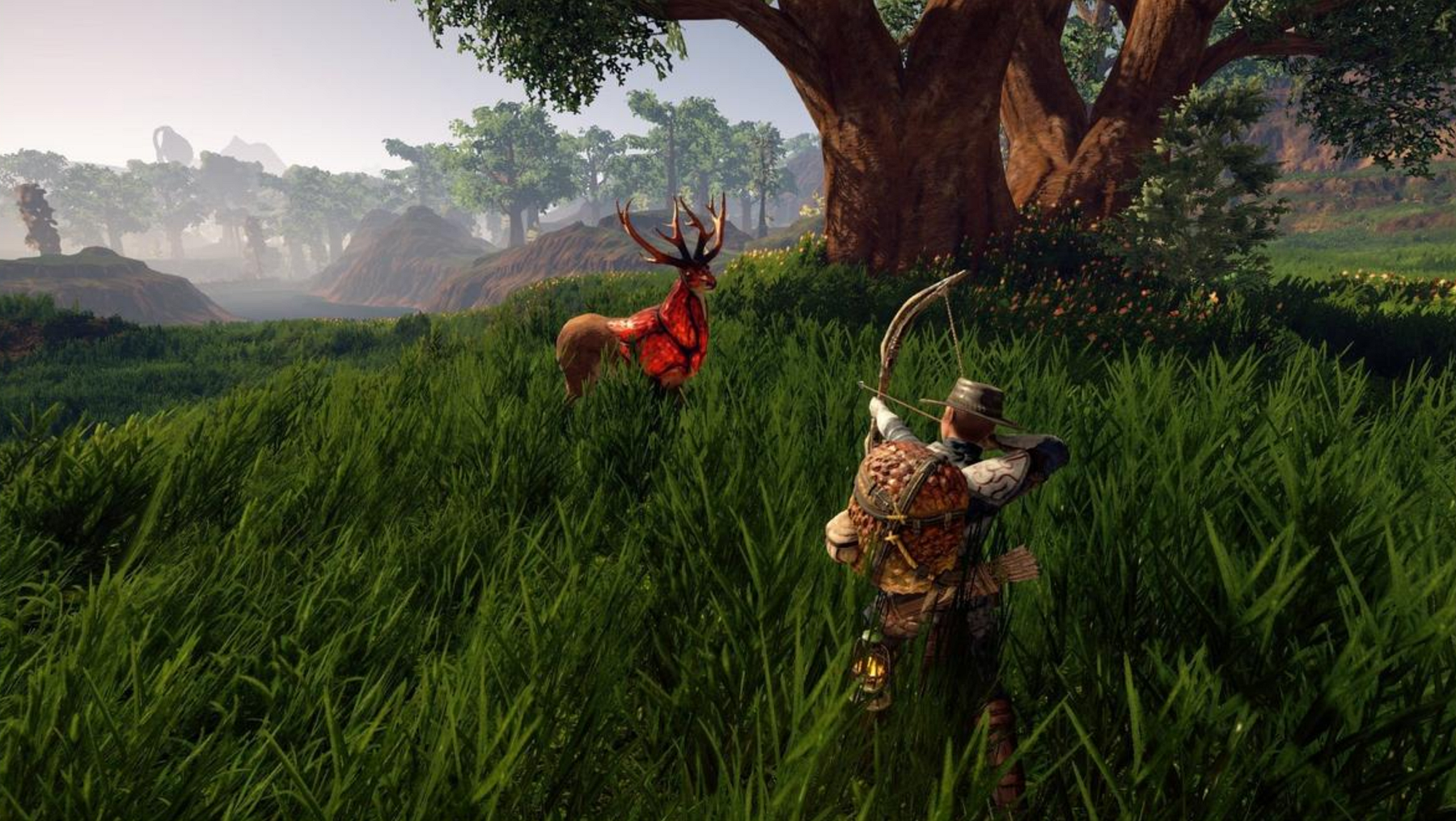
These different design choices reflect the nature of each game:
- Zelda: BOTW is accessible and fun; a limited inventory would hold you back and interfere with freedom of switching play-styles regularly.
- Far Cry 3 has an element of hunting and progression; upgrading your pack lets you feel stronger and more powerful as the game goes on.
- Outward is a realistic 'adventure simulator'; having diversity of choice and seeing it accurately visualised fuels a stronger roleplaying experience.
It's all about balance and context
Some experiences challenge players to make tough decisions about what to carry, and have them literally weigh up the choices of what they can hold; perhaps to create more immersion or keep mechanics balanced. In other games, that might just ruin the fun and disrupt the flow.

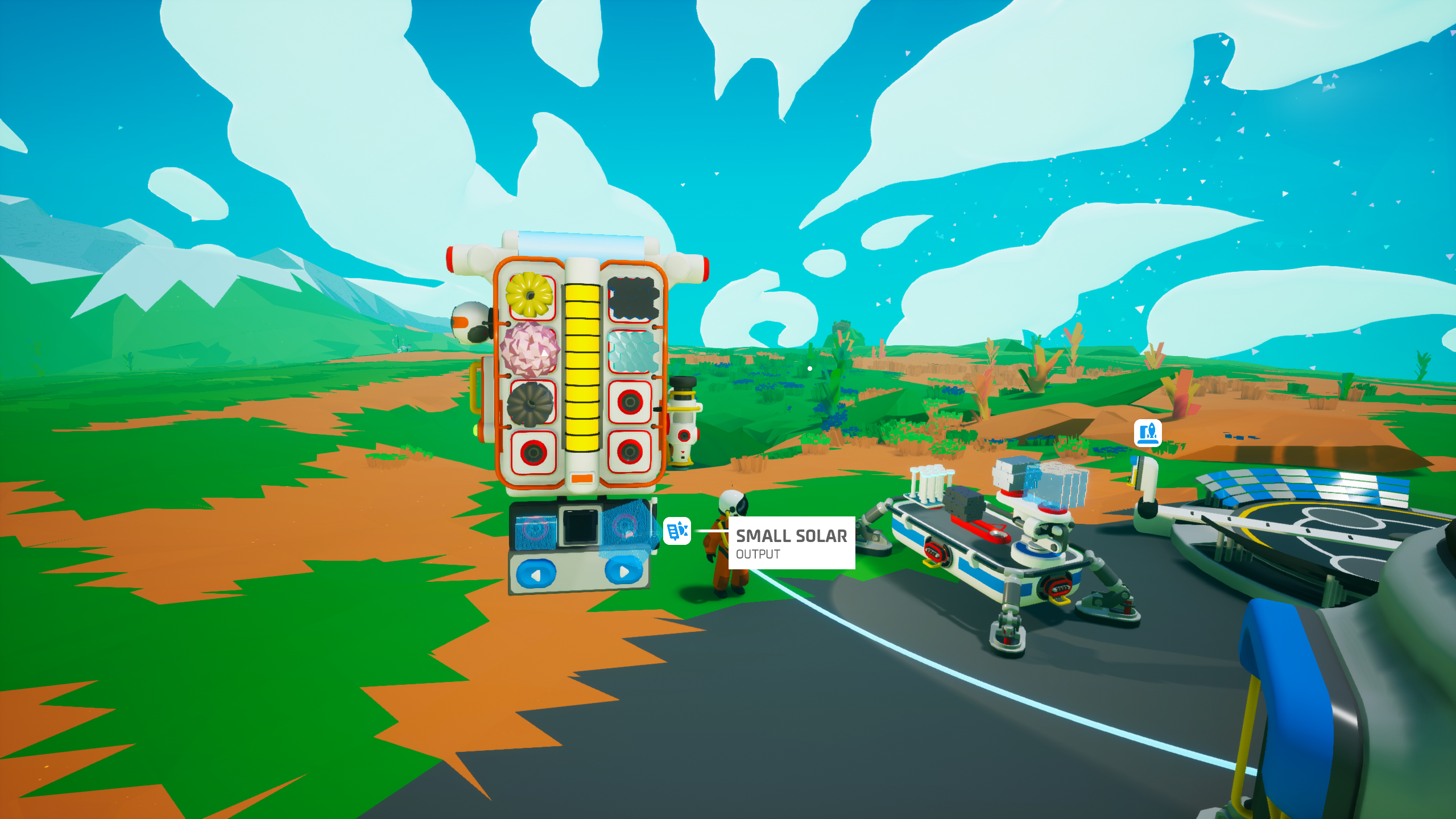
Astroneer rather uniquely shows your backpack at all times and displays the contents of it. On top of that, you can directly interface with it; picking up items, rearranging them and plonking them down directly with your mouse. This novel approach might take a little getting used to, perhaps feeling a bit clunky at first, but I found it quite ingenious.
This simple, semi-diegetic depiction provides the following functionality:
- See how many slots your backpack has.
- See which of those slots are occupied.
- ..and exactly what item(s) occupy them.
- Freely rearrange items.
- Pick up/drop items from the inventory and surrounding environment.
- Craft basic items.
- Attach equipment such as generators, torches and batteries.
- See your current Oxygen and Power levels.
All of this can be done while maintaining a full view of your surroundings, without pausing the game or overlaying the screen with panels.
Of course there are a few aspects that allow Astroneer to do this more effectively than something like Skyrim, for example:
- The limit of items that can be carried is very low.
- The item art is simplistic and scales well.
- The whimsical personality of these interactions and their physical design sits well with the game, it ties into the type of world the designers have built.
Again, this emphasises that there is no global right or wrong way to handle these decisions — the correct answer is the one that is tailored to the story each game aims to tell.
Despite describing Astroneer's backpack approach as 'novel', System Shock was experimenting with something fascinatingly similar as early as 1994.
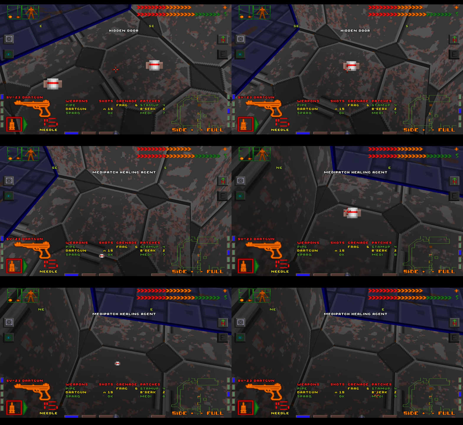
While it may look dated now, developer Looking Glass Studios were ahead of their time.
"The feeling of mousing over something in the environment and dragging it into my inventory is still really powerful. It feels like I'm reaching into the world; it's surprising how few games use this simple idea to establish a direct connection between player, the screen and the environment."
— Revisiting System Shock, and the birth of immersive sim design
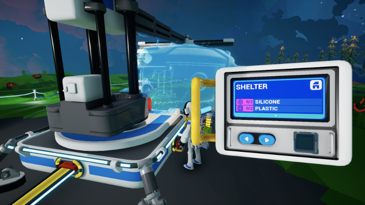

Throughout Astroneer, this same logic of direct interactivity extends beyond the inventory and is maintained consistently across other mechanics. I found these various implementations to sit within two categories: Interactive and Informative.
Interactive:
- Blueprint Research (aka the Tech Tree) is done at a player-built base module. Tabs, navigation and confirmation are carried out through physical interface.
- Advanced Crafting is done at a control panel attached to a 3D printing station. Simple 'in the field' crafting can be done via the backpack.
- Crafting Tree progression is also facilitated through the physical building of these objects. Instead of just unlocking larger crafting trees in a menu, the player just builds the bigger 3D printer once they've researched it.
Informative:
- Oxygen and Power are shown on the player's back
- Power levels are shown on the outside of buildings and batteries
- Direction and strength of power travel is shown on the cables
Progressive Disclosure
By spreading out these chunks of interactivity and information, weaving them into the 3D environment, Astroneer introduces players to all of these 'menus in disguise' progressively. This makes it easier for the player to grasp these features gradually, but also make sense of them logically — you won't know what the crafting menu looks like until you've physically built the 3D printer to craft things with.
Integration into the Core Loop
In Astroneer the core loop might involve going on a longer adventure in the world, collecting materials, hauling them back, and then spending time maintaining and improving that home base. Then going on an adventure again.
A lot of that home improvement will be done via interfaces: moving items between a backpack; printing them on various 3D printers; refining new materials through the centrifuge, etc.
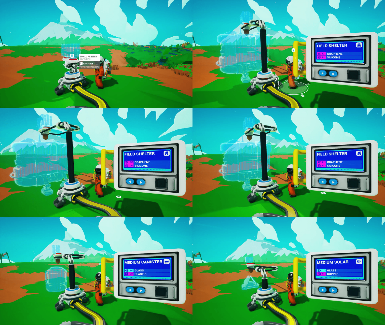
If all of these actions were managed via a traditional abstract interface, the player would spend a lot less time actually seeing their base — causing mundanity and disconnect.
This connection to your items and equipment runs strong through Astroneer. All of the player interactions have a common thread of tactility. Picking up items and plonking them down, reconnecting power cables, watching the centrifuge spin… each come with satisfying whirs, clicks and clunks—reminiscent of the tactile experience of building with LEGO bricks. These creative design decisions across visual, sound and experience design all amount to something that is simply more engaging.
Example 02: Alien Isolation
Drown in retro-futurism and love/hate every minute of it
Alien Isolation is a true ode to the original 1979 movie. It submerses you in that gritty, lo-fi retro-futurism through carefully crafted environment art, characters, narrative, sound design… and of course, interface.
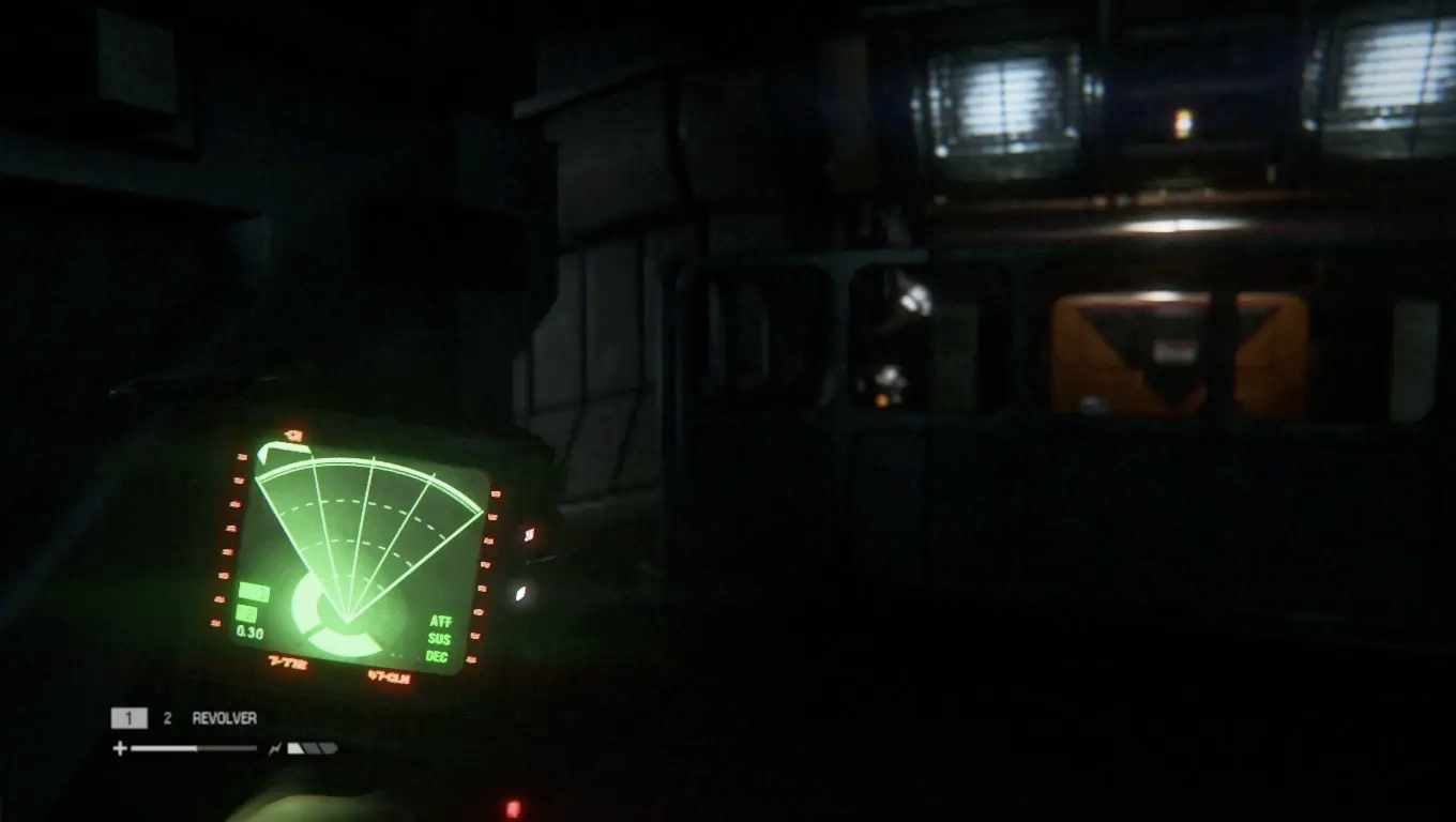
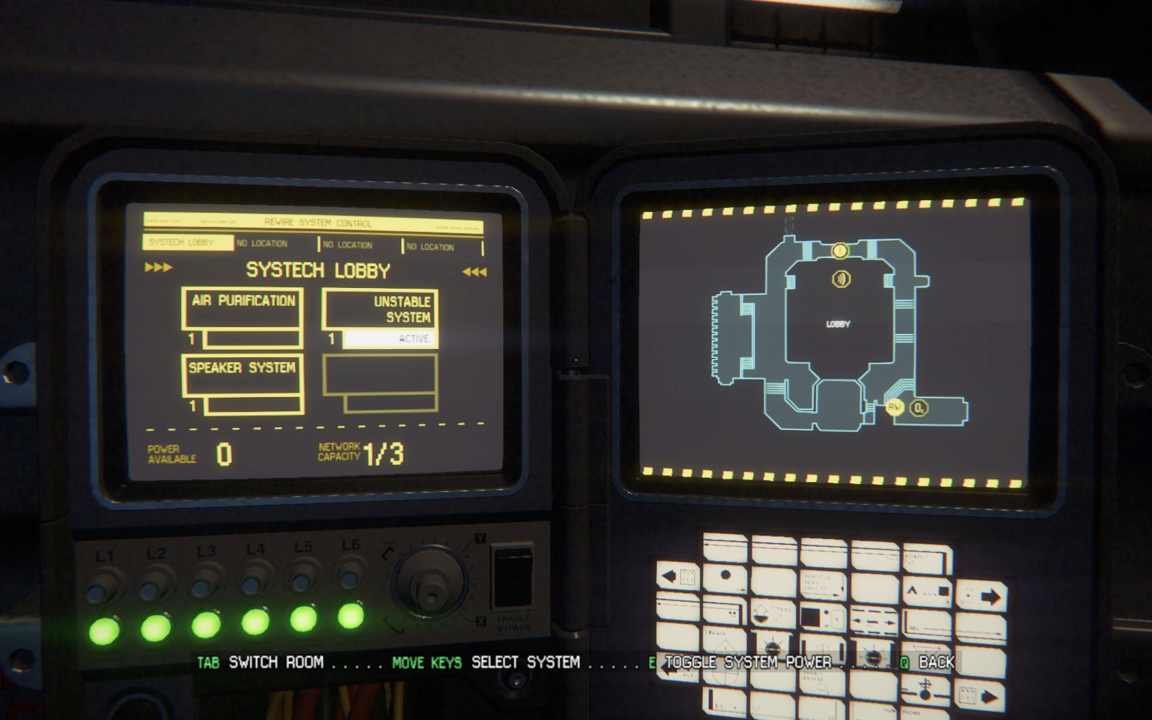
Just like in Astroneer, there are a lot of interactions that could have been quite disconnected from the game world. Placing the Motion Tracker read-out on the HUD would have been a conventional solution, or displaying the Maintenance Terminals in an overlay. Instead, they were anchored diegetically in real-world objects.
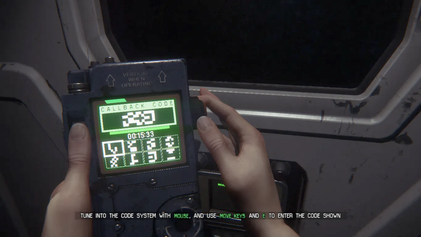
Design choices like this are used throughout. It's kind of confusing sometimes. Intentionally.
Archaic computer terminals and maintenance panels probably weren't designed all that well; they were obscurely specific, and now they're dated.
When there's a drooling, hissing Xenomorph stalking every corner — probably right behind you, poised to leap out of a nearby vent at any moment and trigger that death animation you've watched way too many times — the experience gains an extra layer of tension. Your sweaty palms frantically fumble for the right button to disable the security cameras. You curse as you accidentally enable the air filtration instead.
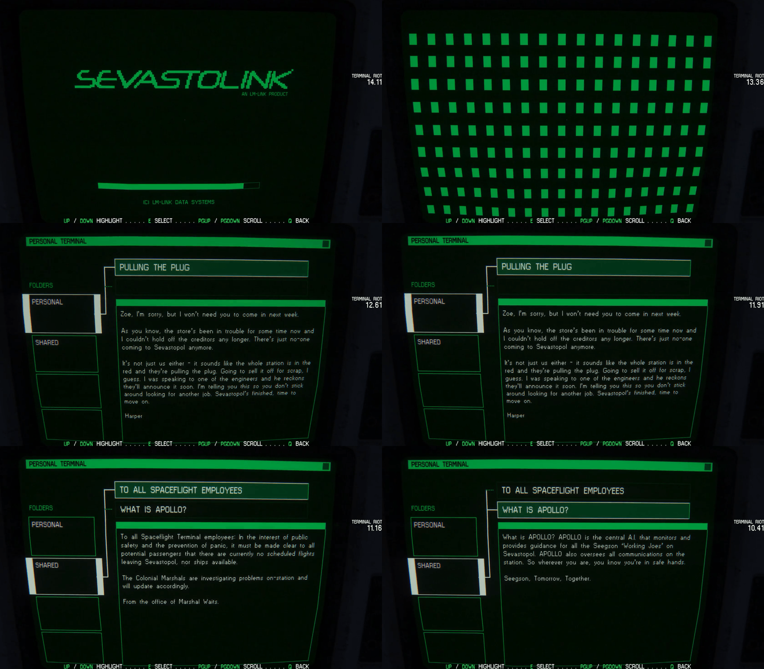
A classic disobedience of UX: 101 — it immerses you in that clunky, primitive world. Amanda Ripley's fear and urgency translates to you, connecting your parallel experiences.
This is backed up by a UI Designer behind Alien Isolation:
"Anything external to Ripley, things that the character could physically interact with, would be rendered in-world as a diegetic interface. For these, function followed form. It had to look and feel like an old piece of primitive software, and for that to work, it had to behave like it. So in terms of usability, the interfaces were deliberately clunky to use, a bit confusing to read. They break so many of the UI presentation rules burned into me over the years.
It was quite a risky and bold thing to do, as I was essentially making stuff deliberately unintuitive! But, the first time people fired up a ReWire terminal, or used the final hacking game, the responses were good. They felt correct, and the clumsiness of the interactions felt appropriate and not nearly as jarring as I feared."
Where they reigned it in
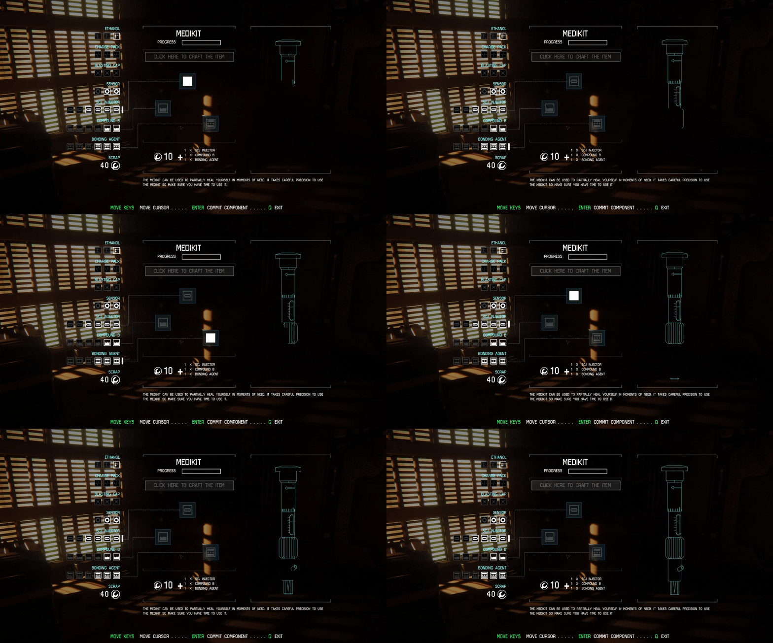
This technique, however, wasn't exhaustive. Occasionally, a decision was made in favour of user-friendliness rather than over-extended realism.
Something more complex like Crafting is given a flatter overlay. Although it's still dressed up in lo-fi style and doesn't exactly feel out of place, there's no attempt to convince the player that this exists in the world; it's not diegetic.
It's interesting to think how this could have potentially been done instead, and what impact this might have had on gameplay (time and budget constraints aside).
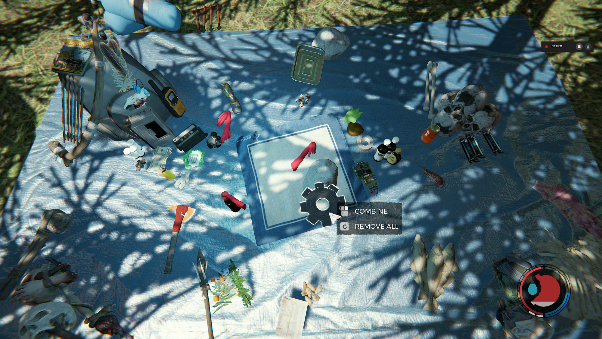
Could Ripley have laid her equipment down similar to how the player would in The Forest?
Could engineering workbenches have been dotted around the world, where the player could see the components and physically piece them together? This would obviously have an impact on the game mechanically — such as limiting the player's ability to craft on-demand, or obscuring their view of the surroundings.
I'd be surprised if the designers at Creative Assembly didn't consider options like these. It might have felt too clunky, perhaps disrupting the gameplay for too long and pulling the player out of the experience.
Nonetheless, although I enjoyed the simplicity and style of the existing crafting interface, I'd love to see an incarnation that tips the balance further towards realism — letting the player experience the tactility and strengthening the narrative of Amanda's engineering profession.
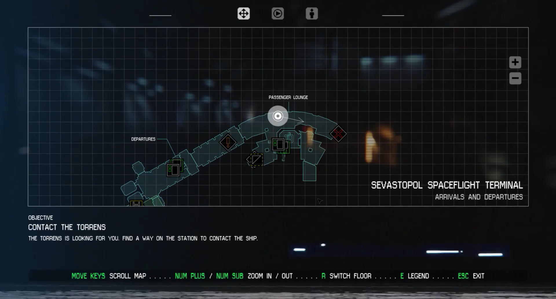
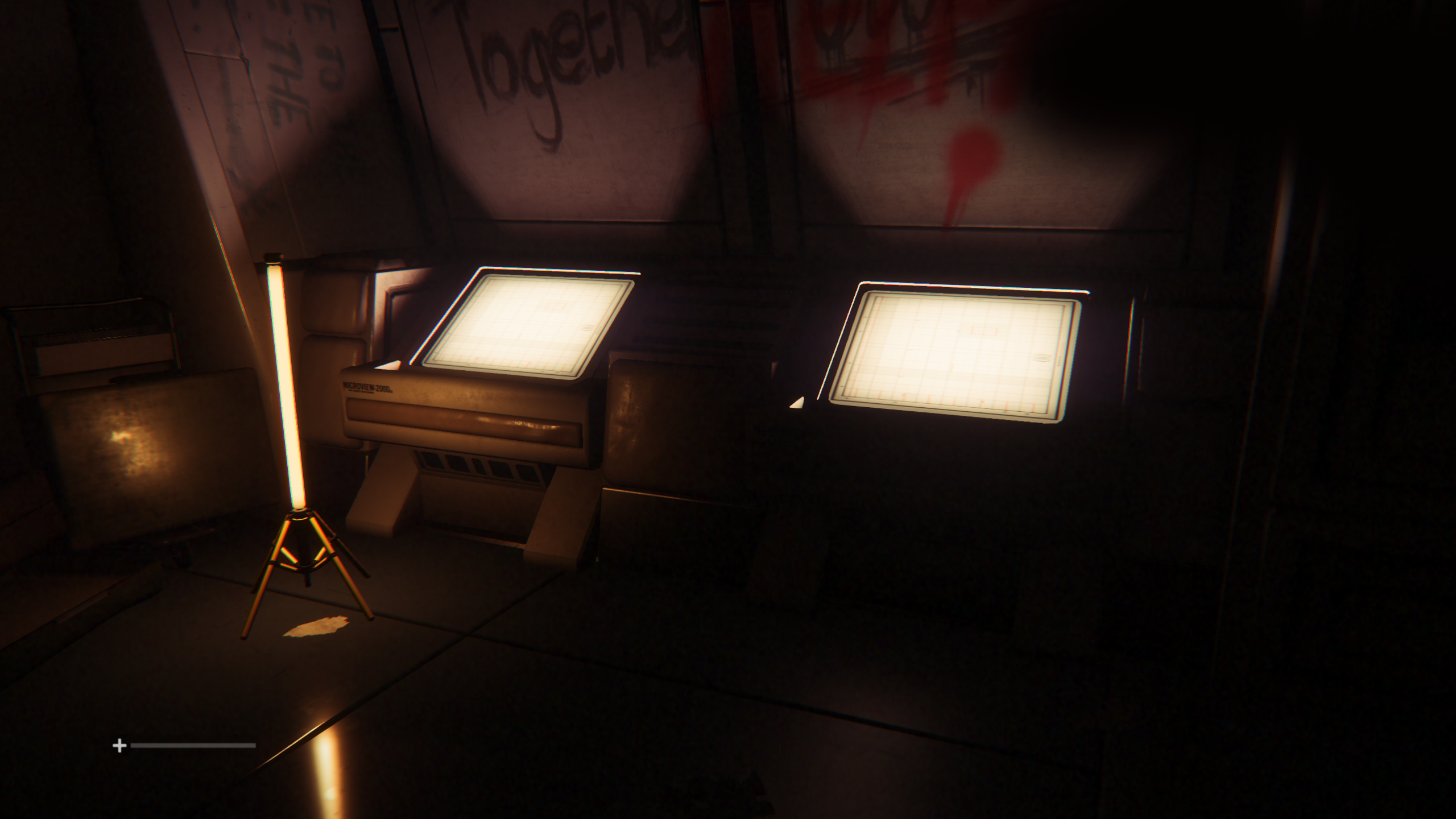
Maps were also given a conventional and disconnected 2D overlay. In fairness, the player did at least have to 'download the data' for the map by interacting with glowing terminals dotted around a level. Only after that could they freely reference it from the menu.
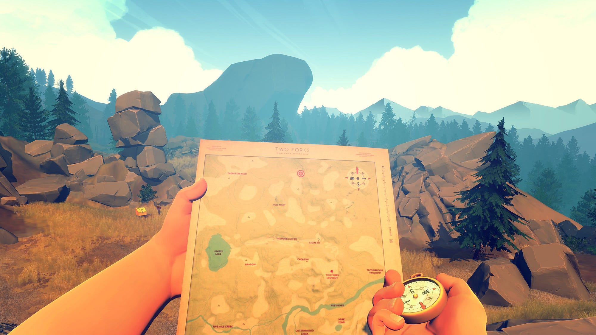
However, exactly how Ripley references that data could have been portrayed more realistically. Could the map have been projected onto a hand-held device that Ripley equips, similar to the paper maps in Firewatch or Minecraft? Maybe it could even have been some extension to the motion tracker, like an upgrade she fashions herself?
Dedication to realism
When designers dedicate themselves to such perfectionist and stringent realism, players are really going to notice when it's not there. Or they'll just assume it is there, and become confused when it's not found.
The designers of Alien: Isolation set a high bar with their realistic portrayal of computer terminals, save points and the motion tracker. Tension and immersion builds as the world continues to exist around you, unpaused. You're vulnerable.
Conversely, open the map and suddenly you're in the safety of a 2D menu where the Alien can't get you and Amanda can calmly plot her route undisturbed.
Normally, Alien Isolation's Map design wouldn't warrant any criticism. But with such a dedicated standard elsewhere, ordinarily insignificant holes become much more conspicuous pitfalls.
Example 03: Horizon: Zero Dawn
Plausible super powers through narrative-embedded UI
Each year, players are spoiled by the increasingly high level of polish and graphic fidelity of modern games. Creators continue to out-do themselves. Yet I can't help but ask myself a question:
If hundreds of people spend thousands of hours and millions of dollars making a rock in a video game look exactly, indistinguishably, no-doubt-about-it-like a real world rock… why do we then shatter the realism and slap any old interface over it? Or let the player just magically see through a wall? Or keep 300 apple pies in their pocket?
Simple answer: Well, because reality isn't always enjoyable or engaging.
Complicated answer: How do we pick-and-choose when we should bypass reality for the sake of 'fun'?
There is a balance to strike. With a bit of creativity — and the resources to execute it — these pitfalls can be carefully navigated around.
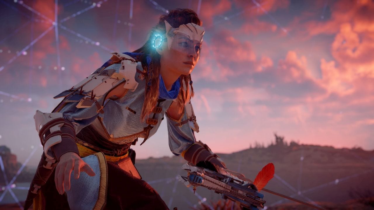
Horizon Zero Dawn achieved this by smoothly embedding aspects of the UI into the fiction of the universe. It was done carefully, in a way players may not even be cognisant of but will subconsciously benefit from.
Aloy can gather intel on enemies and her surroundings, but only after she acquires the Focus device early on in the story.
This allows designers to create functional diegetic interfaces that both the player and Aloy can use, tying in the ability in a believable and immersive way. By intertwining the Focus with the UI, the player can follow objectives and learn tactical information without having to detach from the game world.
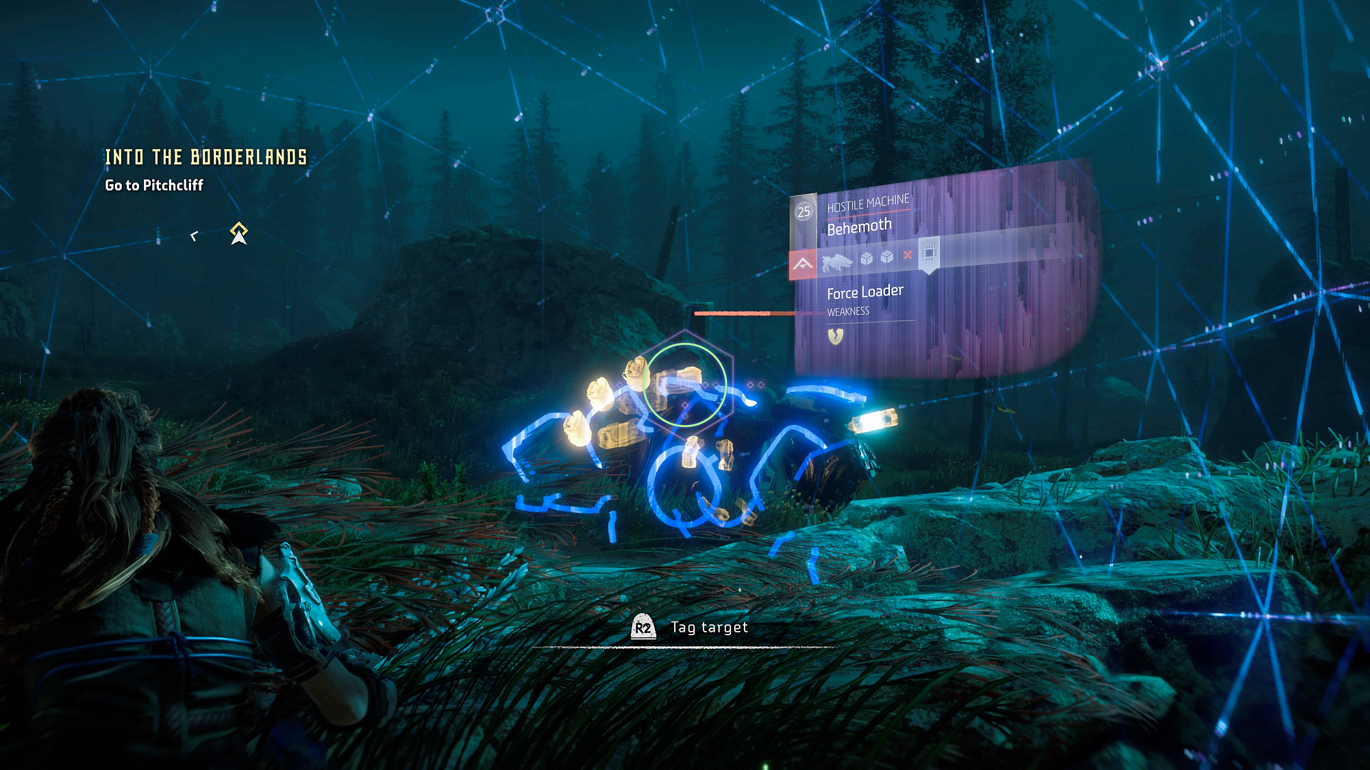
A key characteristic is how the device is naturally written as a core component of the story, not just a tacked-on explanation for Aloy somehow having x-ray vision. All of these details work together to give the player a helping hand (therefore easing frustration) without compromising the believability or immersion of the experience.
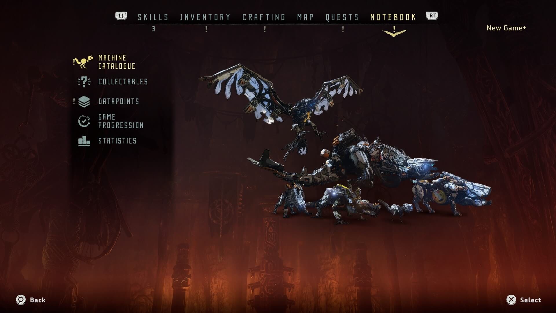
I would have loved to have seen this logic extend to other areas of the game, such as a journal to replace the Bestiary. It's even labelled as a 'Notebook' in the menu bar. Carrying that through into the visuals would have taken the design to the next level. Or perhaps, alternatively, a less analogue approach — maybe the Bestiary is a digital directory found in the Focus HUD? A log of all the data stored in the device so far?
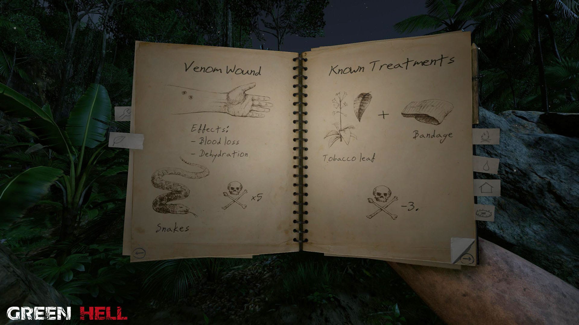
Green Hell's journal acts as a hub of reference for everything the protagonist learns as the game progresses. As well as being a useful directory to replace in-game help guides, it also enforces the connection between the player and their character; emphasising progression through gained knowledge as they unravel their surroundings and adapt to survive.
Storytelling, Game Design and UX/UI Design continue to be closely intertwined.
Example 04: Red Dead Redemption 2
Real life's a drag
Unfortunately, sometimes a game teaches us a lesson on what happens when attention to detail is misplaced, or out of balance.

When Rockstar released RDR2, the video game world was rightfully in awe of the visual splendour. Footprints in the snow. Mountain vistas. You can practically count the pores on Arthur's face as you watch his breath realistically condense in the cold air. Let's not forget the way temperature affects your horse's t — …actually, never mind.
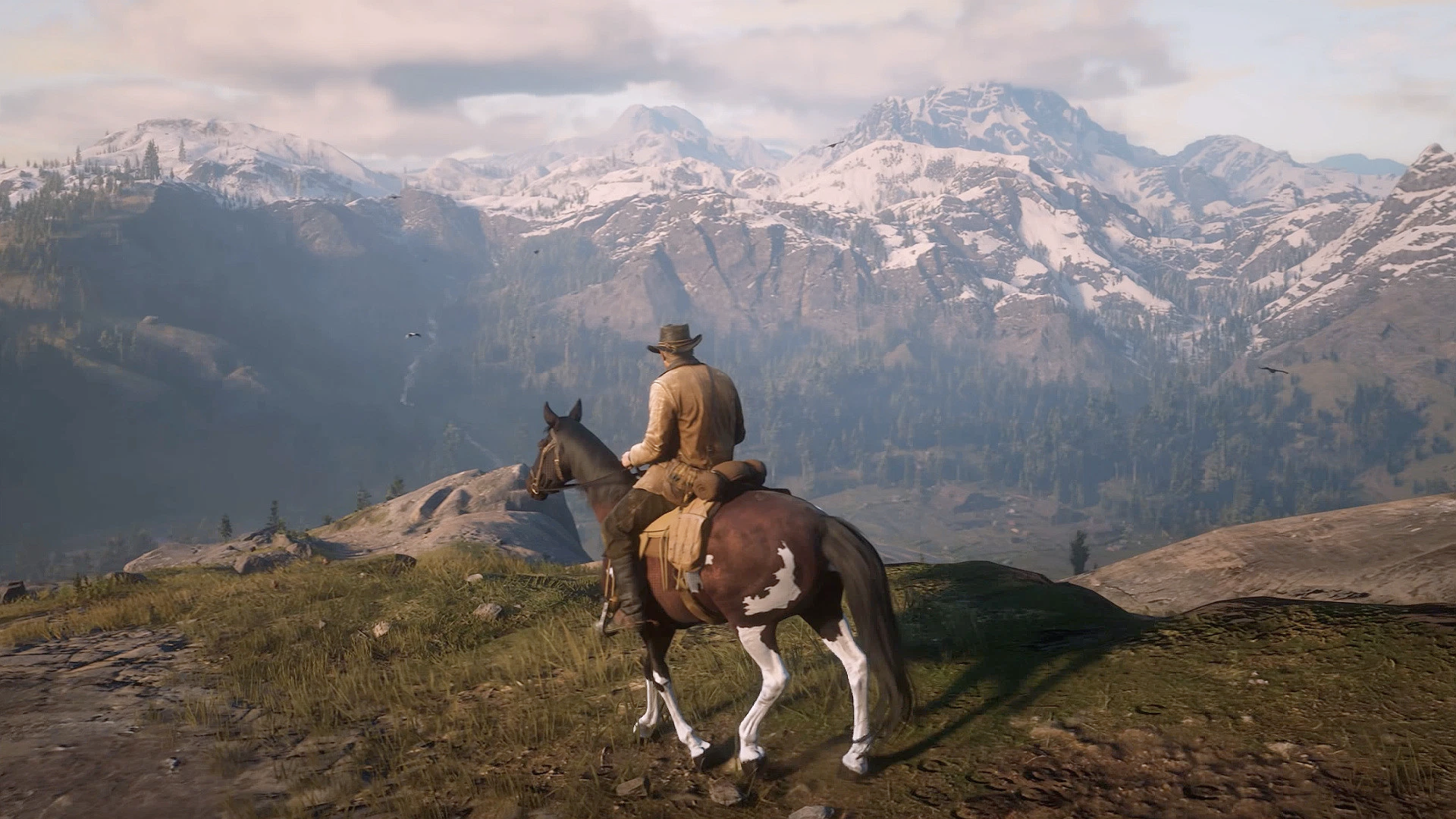
RDR2 is impressively realistic. Hundreds of people came together to achieve an unprecedented feat of development, technical art and storytelling. It's truly something to be commended.
But why is it then, that such a beautifully crafted world amounted to such a remarkably un-immersive experience?
Complexity of Controls
Throughout the game, convoluted controls regularly resulted in accidents. Not only did this cause short term frustration, but also sometimes long lasting negative effects without any way to hit 'Undo'. Ever wanted to wave at a passer by on horseback but accidentally jumped over, hijacked it, crashed into a rock, then limped away with a $500 bounty on your head? Not exactly buttery smooth. In real life, it's pretty tough to get your motor skills that mixed up.
Long-winded and Slow Actions
The more you give, the more players expect. If the snow is indistinguishable from real life, then picking your guns up from the back of your horse should be too. Or searching a drawer for items. Instead, these simple actions felt clunky and difficult.
Instead of losing myself in the game, I was hunting around the edge of the screen for reminders of which buttons I needed to press. I didn't feel like Arthur Morgan, I just felt frustrated.
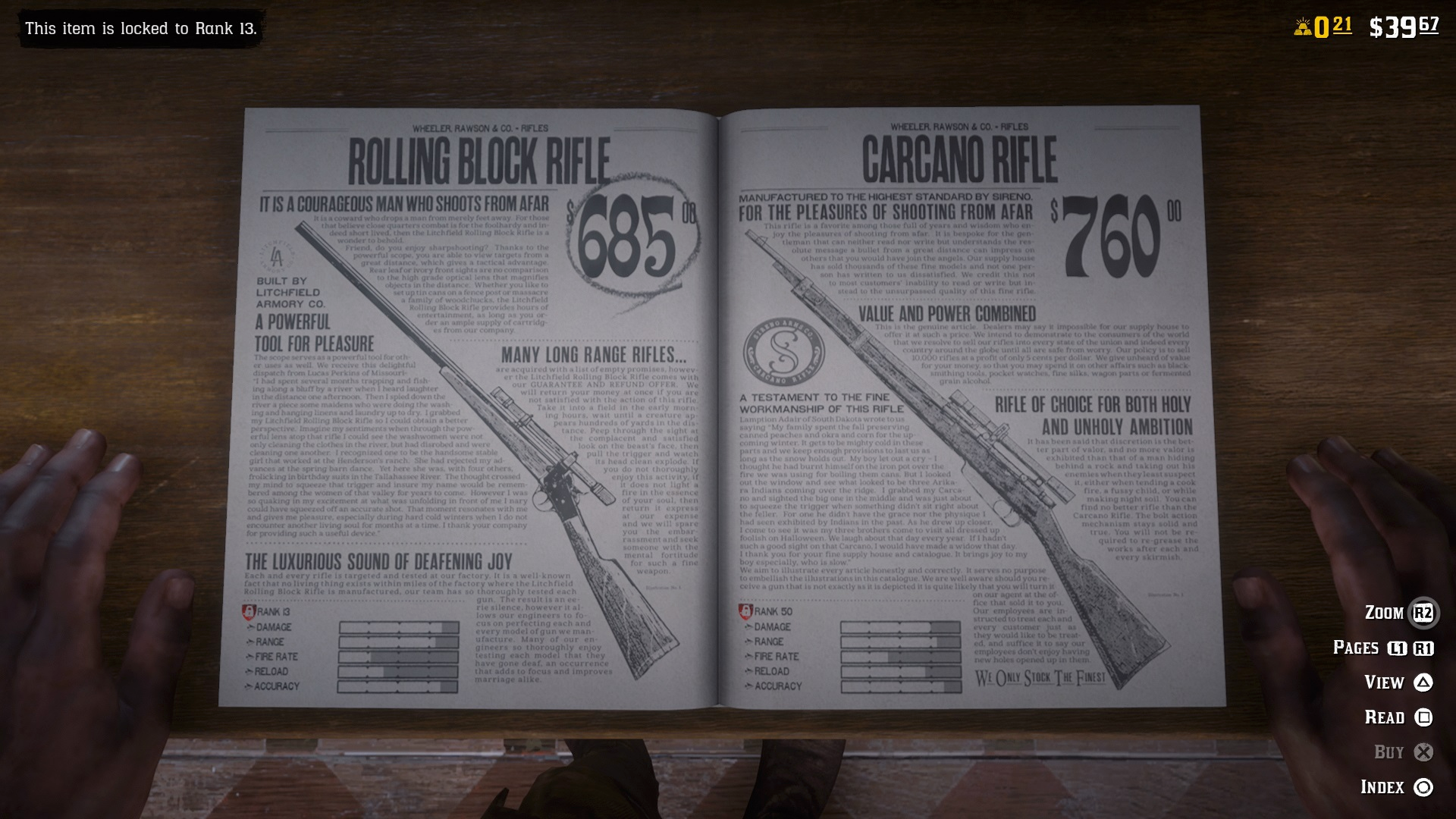
Having said that, although not perfectly executed, there were areas where artistic UI choices did shine through. While browsing through catalogues in a Store I admired the time-period faithful Graphic Design and attention to detail, with stats and prices often embedded into the pages. Although a feeling of sluggishness (and the large family of button hints piled into the corner) may have prevented something like this being a real game-changer, I appreciate designers questioning conventions that can often be hard to break.
Example 05: Outer Wilds
Outer Wilds is a unique and thought-provoking game with a core loop about getting in your ship, going somewhere, learning something, then restarting and doing it again.
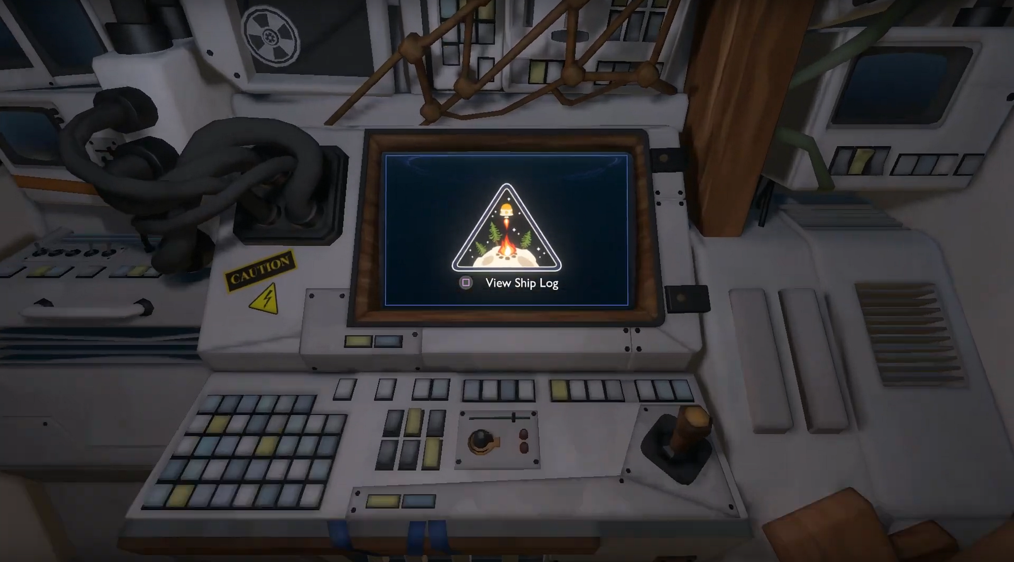
Since each run always begins in the same place, this means that inherently the player will always pass by their ship log — in a physical sense — every time they set off on an adventure.
This is good because, presumably, the designers want to ingrain this habit in the player since it's conducive to a productive game experience. It teaches the player that if they don't know what to do next, consulting their ship log will probably help them figure it out.
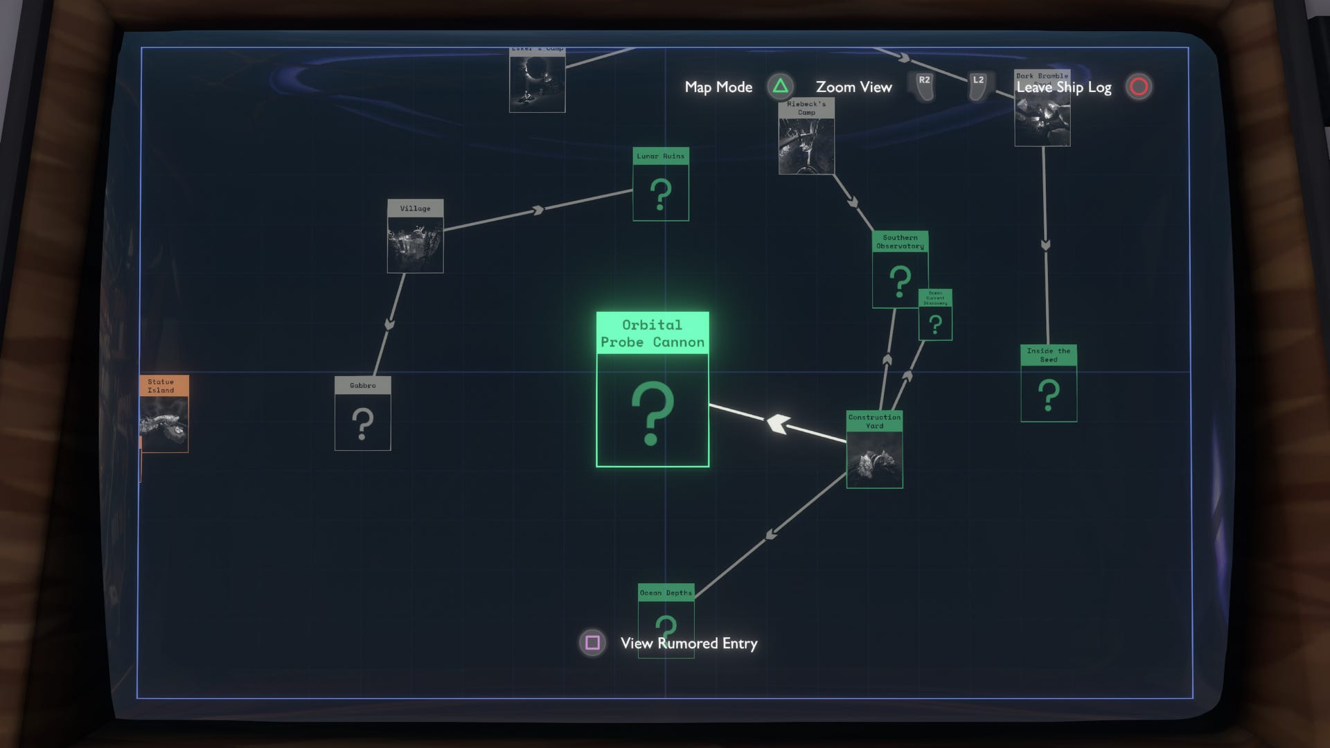
It teaches you that because time is short, it's important to look at the information you've gathered and plan your next steps.
If this action was hidden in an abstract menu behind a generic button press, players might be less likely to make this connection or build this habit. In a game that doesn't hold your hand, this could soon turn from a breath of fresh air into a hindrance.
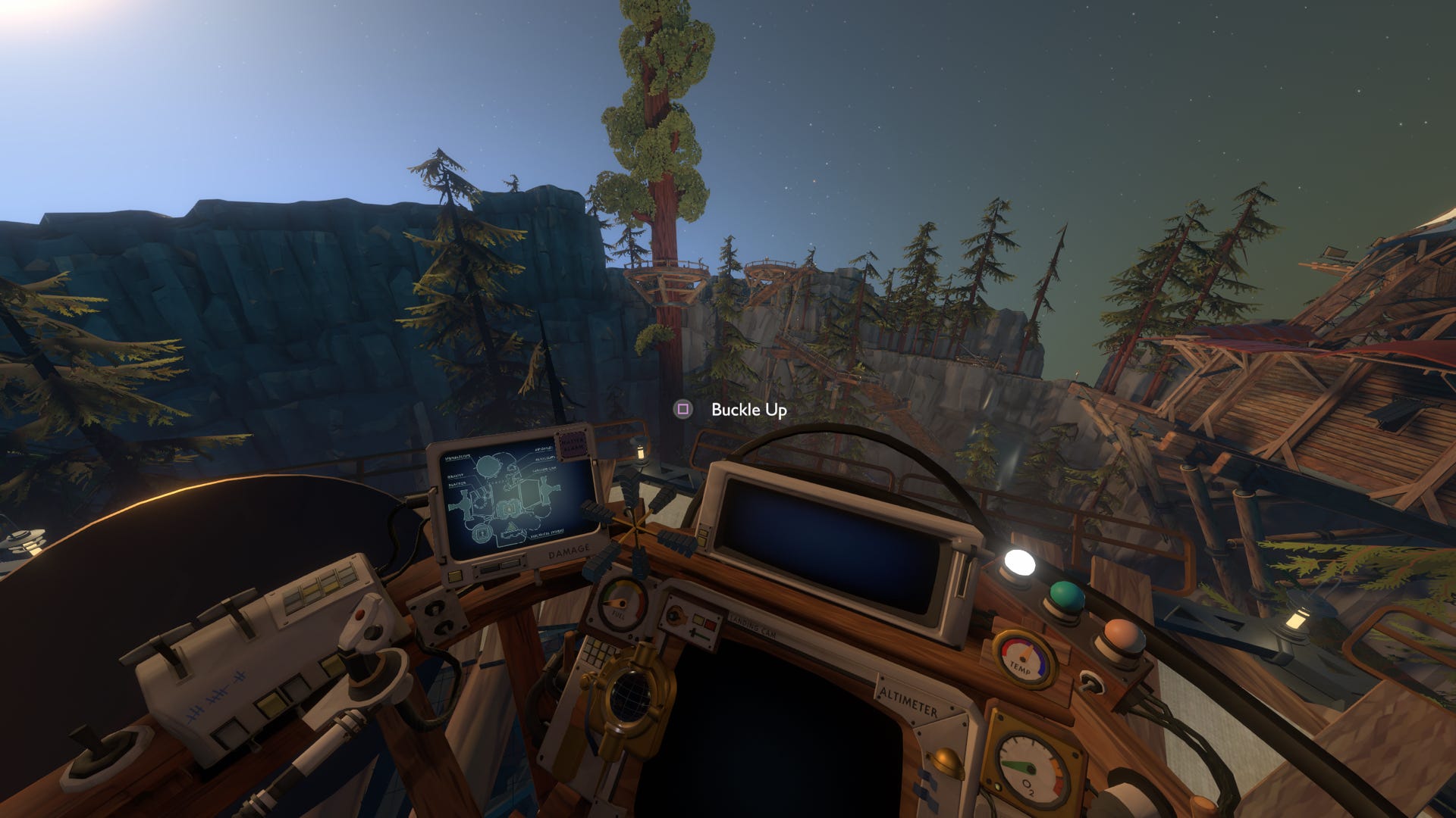
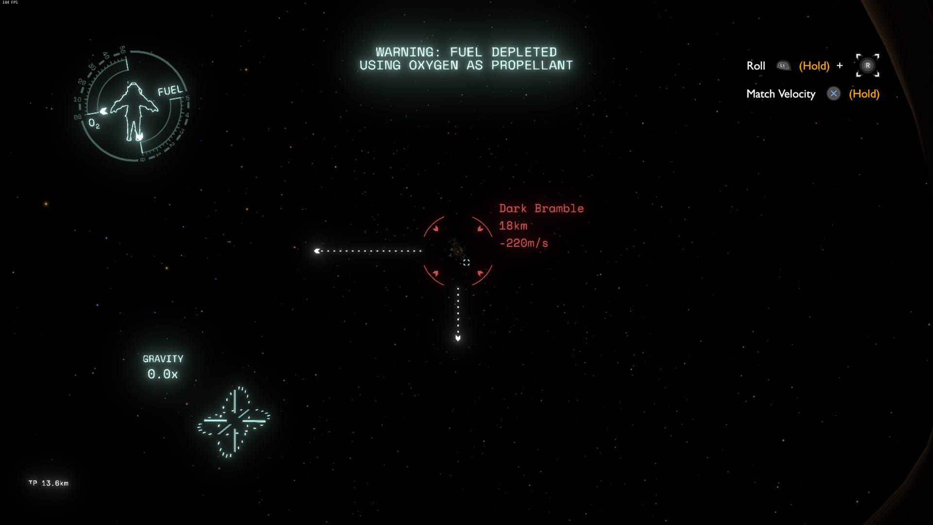
Throughout Outer Wilds, the less interactive and more informative areas of interface continue to be treated with similar care. In flight, you're surrounded by a wonky and hand-crafted cockpit that helps convey the characteristics of a game universe unlike any other.
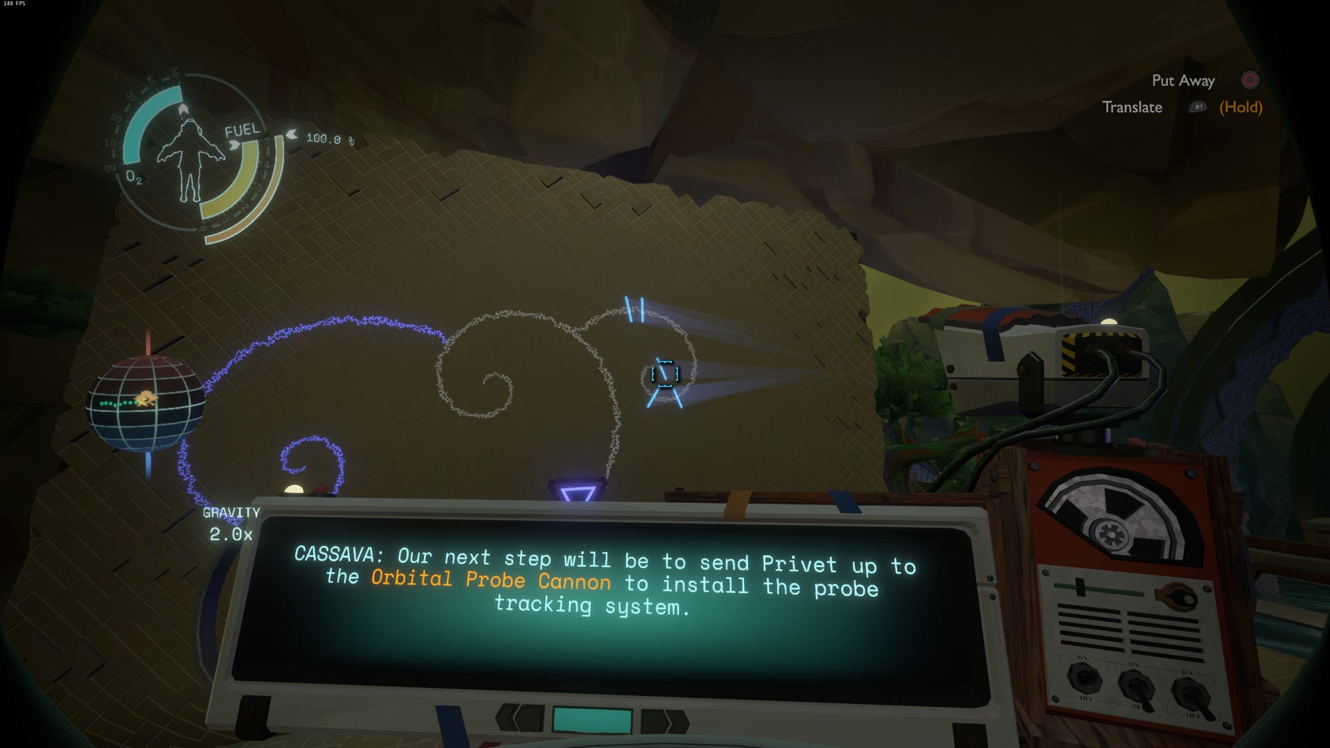
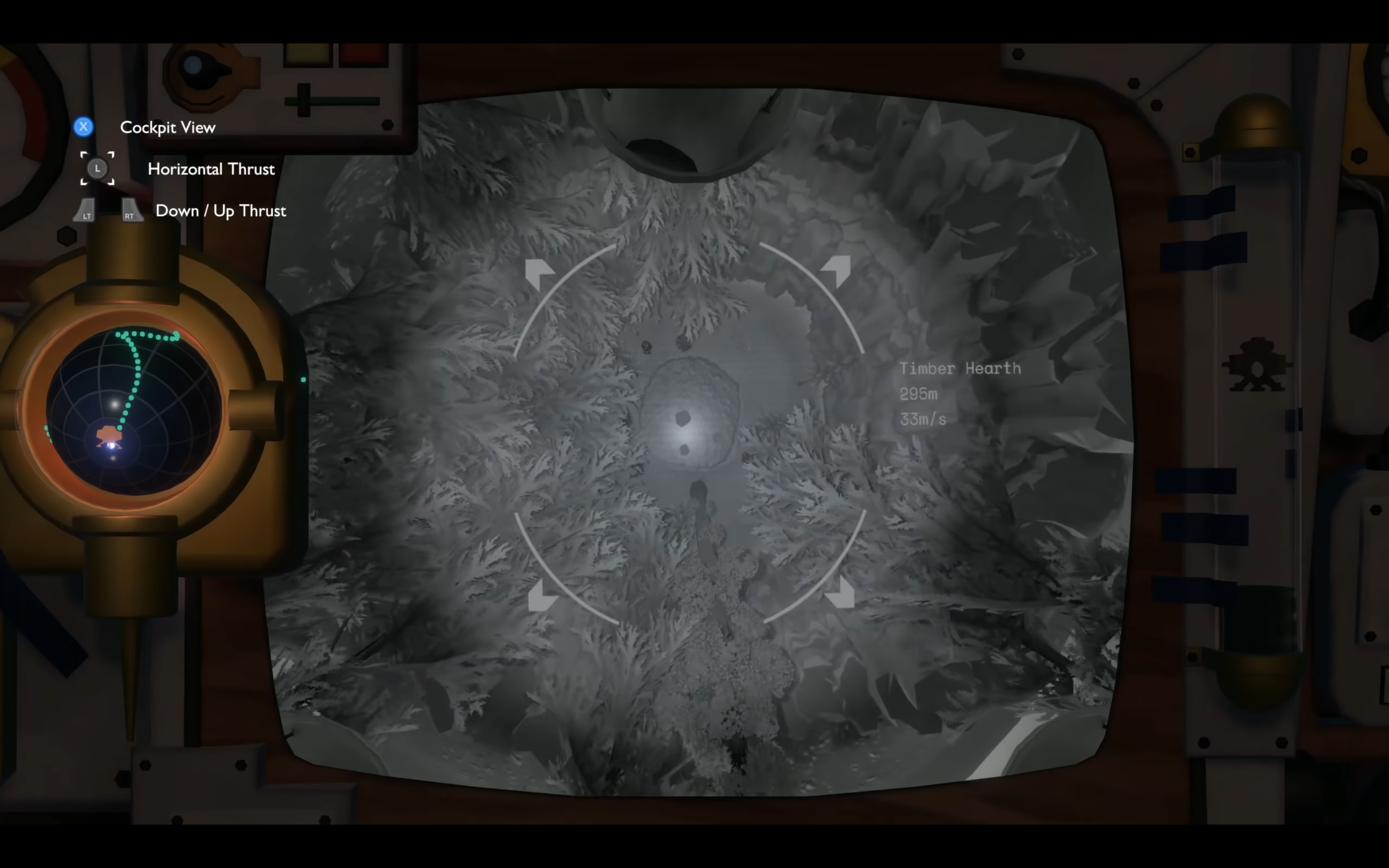
Whether translating alien graffiti or carefully coordinating your landing through the ship's camera, Outer Wilds always looks for opportunities to tell its story.
Final Thoughts
Build a bridge, not a barrier
Sometimes as a UX/UI Designer, your ego starts to take over.
Not out of vanity, but as a natural response to the fact that interfaces are what you think about far more than any other normal human. Deconstructing and analysing every element is hard to resist, even if all you're trying to do is sit and play.. you know, for fun.
Constant submersion in this obsession can make us overemphasise the interfaces we design. This isn't to say the design should be neglected. In fact, it should be considered even more carefully to achieve the most effective and least intrusive experience.
It's commonly said that the best interface is one that goes unnoticed. If they do notice it, it's either because:
a) They've hit a pain point
b) They're 'one of us' and are looking beyond the game and admiring the work
Unfortunately, the former is more likely.
As a designer, our UI must support the game world through fluidity. Not hinder it by being an attention-seeking barrier.
Allow the player to find the interface at precisely the moment they need it, yet allow them to see through it just as easily — to be contentedly unaware of its presence as they flow through the experience.
Key Points to Take Away

01: Immerse
An interface should draw connections between the player and their role in the world we want to immerse them in.
- Immersive interfaces can enhance the overall experience through realism and world building (e.g. Diegetic tools in Alien Isolation).
- An interface can help rationally explain mechanics, rather than be considered an exception (e.g. Focus Device in Horizon Zero Dawn)
- Flow state can be encouraged by letting the player forget about the interface; smooth and simple usability allows the player to focus on play. When realism is tipped in the wrong direction, it can cause frustration or be cumbersome (e.g. Red Dead Redemption 2)
- Stories can be told through thematic interface elements (e.g. Ship Cockpit in Outer Wilds)

02: Guide
As well as simply helping the player accomplish actions, the interface can act as a guide to help direct the experience or provide control.
- Remove obstacles between simple tasks like viewing and managing the contents of your inventory (e.g. Backpack in Astroneer).
- Build habits — help the player memorise the function or location of a mechanic, and actually use it (e.g. Ship Log Outer Wilds).
- Support Game Design principles through balance and control (e.g. Alien Isolation: players can't track the Alien until they find the Motion Tracker, which they can't overuse because the sound might attract hostiles).
- Provide rational explanation for gating progression. (E.g. Astroneer: Unlocking the next level in a Crafting Tree doesn't just magically appear in a new tab, it's visible via a bigger 3D Printer that the player has now built).

03: Minimise
While the interface is incredibly important, that doesn't mean there should be more of it. Minimise UI where possible to let the player focus on what's important.
- Complex or commonly repeated actions should focus on accessibility, convenience and speed — there is a time and place for extra theming (e.g. Crafting and viewing the Map in Alien Isolation took a more simplified approach that favoured utility).
- Simplify the experience by reducing the amount of 'menus', let the player spend more time playing and not traversing the interface (e.g. Core actions in Astroneer are integral parts of the gameplay so were not constricted to traditional menus).
I hope you found this article interesting. If you have come across some clever interfaces in video games, please share them! How do they help connect the player to the game world, or improve the experience? Or maybe you've played game where you felt disconnected because of the interface? Let me know.
bientôt jeu video interface design
Source: https://uxdesign.cc/how-video-game-ux-ui-can-bridge-the-gap-between-players-and-the-game-3727d3b69aa9
Posted by: daleytherning.blogspot.com

0 Response to "bientôt jeu video interface design"
Post a Comment